STYLE GUIDE

Logo

We only use logo in three places in this website:

  • Header/nav

  • Footer

  • Favicon

Main logo

SVG image used in header/navbar. The optimal size is 137x36 px

Footer logo

SVG image used in section. The optimal size is 122x28 px

Favicon

PNG image to be used as favicon. The optimal size is 36x36 px

STYLE GUIDE

Colors

There are two colors category used in this website

  • Primary Colors. These are the Balthazar brand colors.

  • Neutral Colors. These are user interface colors, used mainly for user interface elements in the website, such as texts, backgrounds, borders.

There are two colors category used in this website

  • Primary Colors. These are the Balthazar brand colors.

  • Neutral Colors. These are user interface colors, used mainly for user interface elements in the website, such as text, backf

Primary Colors

Primary

#23E886

HSLA(150, 81, 52, 100%)

Used mainly for buttons

Primary 70

#0A8F4D

HSLA(150, 87, 30, 100%)

Used mainly for text links

Primary 10

#23E886

HSLA(150, 81, 52, 100%)

Used mainly for colored backgrounds or highlights

Neutral Colors

Neutral 85

#212429

HSLA(218, 11, 15, 100%)

Mainly used as heading/title colors, as well as dark background

Neutral 75

#3B3E44

HSLA(220, 7, 25, 100%)

This is default body text color

Neutral 60

#5F646D

HSLA(219, 7, 40, 100%)

Main used for muted text color

Neutral 40

#9297A0

HSLA(219, 7, 60, 100%)

Can be used for muted text color or icon color.

Neutral 25

#BEBDC1

HSLA(255, 3, 75, 100%)

Can be used as icon color, bold border color, also a muted text color in dark background.

Neutral 10

#E4E4EB

HSLA(240, 15, 91, 100%)

Use this color for background, body text color on dark background, and light/mute border color.

Neutral 00

#FFFFFF

HSLA(0, 0, 100, 100%)

White. Main light background color, and title/heading text color on dark background.
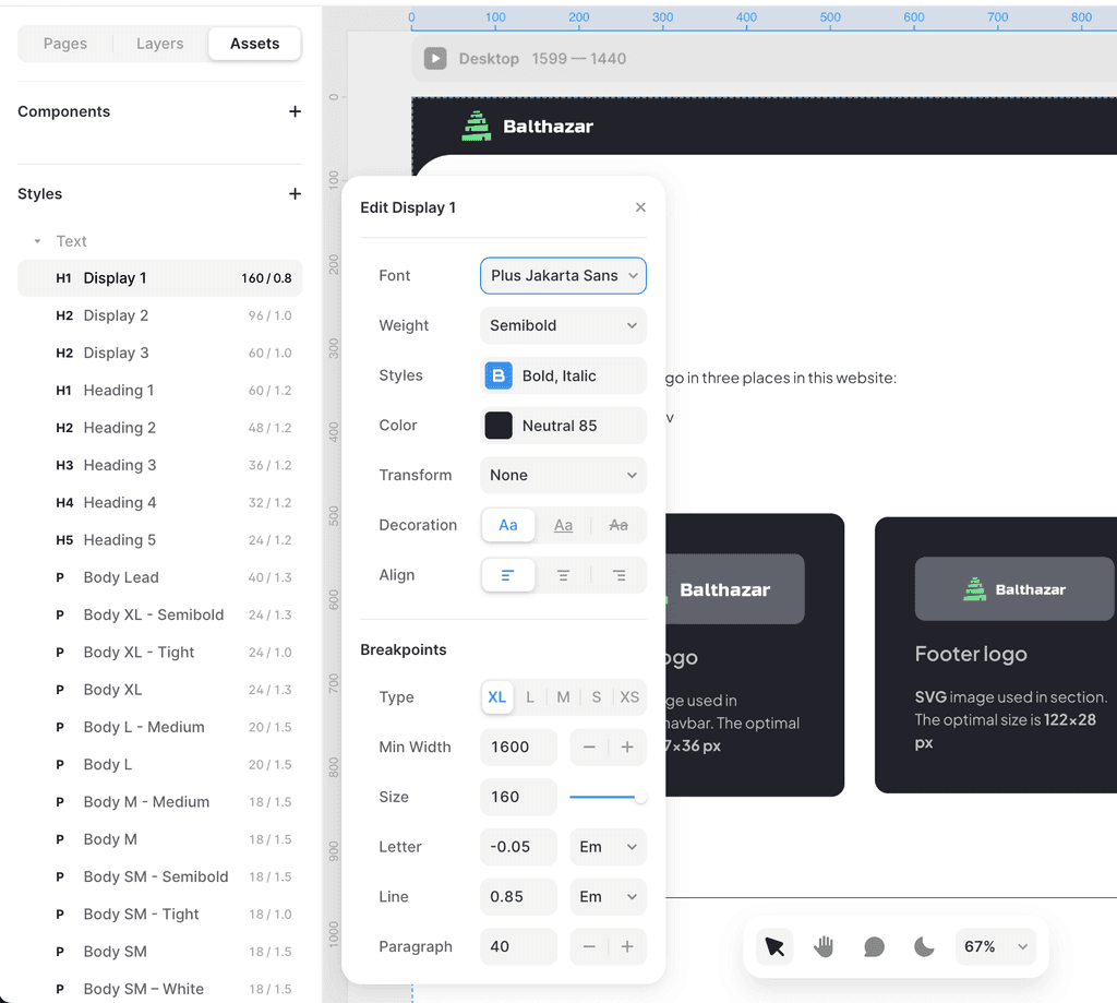
STYLE GUIDE

Typography

We only use one Typeface for this website

There are two colors category used in this website

  • Primary Colors. These are the Balthazar brand colors.

  • Neutral Colors. These are user interface colors, used mainly for user interface elements in the website, such as text, backf

Plus Jakarta Sans

There are two colors category used in this website

  • Primary Colors. These are the Balthazar brand colors.

  • Neutral Colors. These are user interface colors, used mainly for user interface elements in the website, such as text, backf

ABCDEFGHIJKLMNOPQRSTUVWXYZ

abcdefghijklmnopqrstuvwxyz

1234567890

ABCDEFGHIJKLMNOPQRSTUVWXYZ

abcdefghijklmnopqrstuvwxyz

1234567890

There are two colors category used in this website

  • Primary Colors. These are the Balthazar brand colors.

  • Neutral Colors. These are user interface colors, used mainly for user interface elements in the website, such as text, backf

Plus Jakarta Sans Regular
Plus Jakarta Sans Medium
Plus Jakarta Sans Semibold

Plus Jakarta Sans Regular
Plus Jakarta Sans Medium
Plus Jakarta Sans Semibold

There are two colors category used in this website

  • Primary Colors. These are the Balthazar brand colors.

  • Neutral Colors. These are user interface colors, used mainly for user interface elements in the website, such as text, backf

Display Text Style Hierarchy

These are "display" text styles that used as title, section-title, page-title in the website.

There are two colors category used in this website

  • Primary Colors. These are the Balthazar brand colors.

  • Neutral Colors. These are user interface colors, used mainly for user interface elements in the website, such as text, backf

Display 1

Use this text style for Hero copy/text

There are two colors category used in this website

  • Primary Colors. These are the Balthazar brand colors.

  • Neutral Colors. These are user interface colors, used mainly for user interface elements in the website, such as text, backf

Display 1

This can be used to style a page title or a section title

There are two colors category used in this website

  • Primary Colors. These are the Balthazar brand colors.

  • Neutral Colors. These are user interface colors, used mainly for user interface elements in the website, such as text, backf

Display 1

Use this to style section title

There are two colors category used in this website

  • Primary Colors. These are the Balthazar brand colors.

  • Neutral Colors. These are user interface colors, used mainly for user interface elements in the website, such as text, backf

Headings Text Style Hierarchy

These are the normal body text styles that used in paragraph, blog, research, etc.

There are two colors category used in this website

  • Primary Colors. These are the Balthazar brand colors.

  • Neutral Colors. These are user interface colors, used mainly for user interface elements in the website, such as text, backf

Heading 1

Only use this heading 1 in a blog post, for section title, use Display text style

There are two colors category used in this website

  • Primary Colors. These are the Balthazar brand colors.

  • Neutral Colors. These are user interface colors, used mainly for user interface elements in the website, such as text, backf

Heading 2

Only use this heading 2 in a blog post, for section title, use Display text style

There are two colors category used in this website

  • Primary Colors. These are the Balthazar brand colors.

  • Neutral Colors. These are user interface colors, used mainly for user interface elements in the website, such as text, backf

Heading 3

You can use this to style section title or blog post/article headings

There are two colors category used in this website

  • Primary Colors. These are the Balthazar brand colors.

  • Neutral Colors. These are user interface colors, used mainly for user interface elements in the website, such as text, backf

Heading 4

You can use this to style section title or blog post/article headings

There are two colors category used in this website

  • Primary Colors. These are the Balthazar brand colors.

  • Neutral Colors. These are user interface colors, used mainly for user interface elements in the website, such as text, backf

Heading 5

You can use this to style section title or blog post/article headings

There are two colors category used in this website

  • Primary Colors. These are the Balthazar brand colors.

  • Neutral Colors. These are user interface colors, used mainly for user interface elements in the website, such as text, backf

Body Text Style Hierarchy

There are several sizes of body text used in this website

There are two colors category used in this website

  • Primary Colors. These are the Balthazar brand colors.

  • Neutral Colors. These are user interface colors, used mainly for user interface elements in the website, such as text, backf

Body Lead

To be used as a lead-paragraph in an article or a section

There are two colors category used in this website

  • Primary Colors. These are the Balthazar brand colors.

  • Neutral Colors. These are user interface colors, used mainly for user interface elements in the website, such as text, backf

Body XL

If you need an extra large body text

There are two colors category used in this website

  • Primary Colors. These are the Balthazar brand colors.

  • Neutral Colors. These are user interface colors, used mainly for user interface elements in the website, such as text, backf

Body L

A larger body text

There are two colors category used in this website

  • Primary Colors. These are the Balthazar brand colors.

  • Neutral Colors. These are user interface colors, used mainly for user interface elements in the website, such as text, backf

Body M

The normal body text, this one is the defaul body text used in most of the text in the website

There are two colors category used in this website

  • Primary Colors. These are the Balthazar brand colors.

  • Neutral Colors. These are user interface colors, used mainly for user interface elements in the website, such as text, backf

Body SM

Smaller body text

There are two colors category used in this website

  • Primary Colors. These are the Balthazar brand colors.

  • Neutral Colors. These are user interface colors, used mainly for user interface elements in the website, such as text, backf

Body XS

The smallest body text

There are two colors category used in this website

  • Primary Colors. These are the Balthazar brand colors.

  • Neutral Colors. These are user interface colors, used mainly for user interface elements in the website, such as text, backf

Text Style Properties

To see the complete text styles and all of their properties and setting, you can view them in Framer > Assets > Styles > Text

There are two colors category used in this website

  • Primary Colors. These are the Balthazar brand colors.

  • Neutral Colors. These are user interface colors, used mainly for user interface elements in the website, such as text, backf

STYLE GUIDE

Imagery and Iconography

There are several stock imageries and icons used in this website. All of these assets are obtained legally.

There are two colors category used in this website

  • Primary Colors. These are the Balthazar brand colors.

  • Neutral Colors. These are user interface colors, used mainly for user interface elements in the website, such as text, backf

Imagery

There are two colors category used in this website

  • Primary Colors. These are the Balthazar brand colors.

  • Neutral Colors. These are user interface colors, used mainly for user interface elements in the website, such as text, backf

Iconography

This website uses Phospor Icons: https://phosphoricons.com/, and use a built-in component provided by Framer itself.

There are two colors category used in this website

  • Primary Colors. These are the Balthazar brand colors.

  • Neutral Colors. These are user interface colors, used mainly for user interface elements in the website, such as text, backf